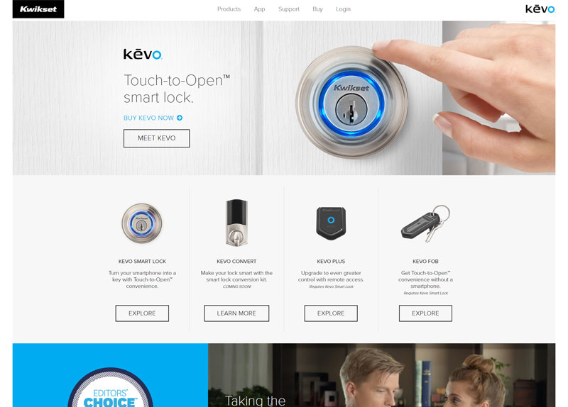
Kwikset Kevo
Upgrading the responsive Kwiket Kevo microsite to a new aesthetic.

- CMS: Sitefinity
- Browser Support: IE9+, modern browsers
- Type: Responsive microsite
About This Project
I started this website with the goal of having very clean css, since ideally we want this site to go into the newly redesigned Kwikset.com site when that happens. With that goal in mind, I decided to try using the BEM naming convention for CSS. I honestly thought that BEM was super ugly looking, but I'd seen its praises sung often enough to be curious.
What resulted is, I think, one of the cleanest sites I've ever worked on. I was able to reuse a lot more CSS than I normally am able to and loved that I could have so many reused components across the website. I can probably count the number of specificity issues I encountered on one hand. In a word: awesome.
Lessons Learned
- This was the first site I worked on with BEM CSS. There was a fair amount of rewriting I ended up doing (I probably spent a week doing the nav, learning how to do BEM at the same time) but I ended up loving it.
- This was also the first site where I tried using css classes specific to JavaScript that had no styling attached but could be used to call scripts, such as for magnific popup or a scroll handler. That worked out pretty well and I'm definitely going to continue doing that in the future.